Unit 5 Evaluation

Unit 5 Evaluation 

Research

To begin my project ‘inspired by’ from the V&A museum, I gathered research from different sources. The photography I took during the Dolphinholme residential and also the 3D and visual communication pathways were a good basis to build from and carry through my inspirations to develop ideas. I visited the Victoria and Albert museum in London and chose my ‘inspired by’ collection which was a set Iranian Architectural drawings from the 18th century. From this point I began to form concepts and look into a range of artists to build up my influences. I feel my research was sustainable and probably one of my strongest areas especially in the beginning of the project, although I could of gained more valuable knowledge from looking at books rather than mainly on the internet. I feel that towards the end (when I was in London on work experience) my project suffered as I lost direction due to being out of the workshops and studios. In FMP I am aiming to be overly productive in all aspects and would like to gather a broad range of research from primary photos, artists and designers and regularly update my blog.

Development

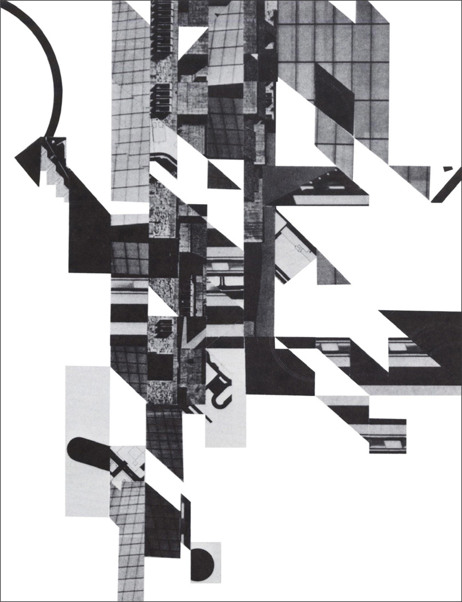
At the start of the project I used the process mono-printing, I liked using this as I found I achieved some effective lines when using the templates from photos that I had taken from the 3D/wire drawing I created. As drawing is one of my weaknesses and something I desperately want to improve on it gave the impression in its broadest sense I was able to draw. To develop my project I took photographs of my journey home from college and found some very interesting marks in the pavement. Then I began to use hand stitch and CAD to further develop my pieces. I wish that I had explored more techniques to give my self a broader range of work and this is something that I will make sure I do in my FMP. Some work is done to a reasonable standard and others could be improved by spending more time on them and including more processes. Towards the end of the project to show further development I did a photoshoot projecting some images and photography that I had taken onto a dress I had made during my 2 years on the fashion and textiles course.

Time management

I found I managed my blog posting well throughout the majority of the project however when I finished college for christmas and went to London for work experience I didn’t return for a whole month. In this time I didn’t work on any aspect of my project which I feel really would of effected the mass of work I produced as well as the quality of my blog. In the 12 weeks we had on this project I could of practiced a better standard of time management including keeping a weekly work plan. I will be bringing this in to my FMP to keep on track. I also will be evaluating my project more often instead of waiting until the end to do so. With getting my portfolio ready for university interviews I haven’t payed as much attention on getting this project rounded off with a final piece. I will now be able to fully focus onto my FMP and be putting my all into it. Another effect on my time management is the fact I work over 25 hours per week as well as college, I am unable to commit to coming into college on Fridays and also have to leave slightly early Monday and Tuesdays to get to work in time.

Outcomes

To be totally honest I am not completely pleased with my outcomes. I have no final conclusion to my project which I feel doesn’t round it off. The pieces I have created could of been developed more and more techniques used.

Blog

I have really enjoyed using a blog this year. It is the first time I have depended on using a blog rather than a sketch book and I have found it much easier. Although sketch books are more visually interesting and also better on keeping track of my work, my blogs has been more efficient and saved me printing out wasting paper. On my blog I have managed to keep on track of my work and regularly posting inspirations, targets and so on. It is a more convenient for interviews as I can show on a sleek iPad rather than a big bulky sketch book spilling out with bits of material and pieces of work.

Conclusion

I have learnt a lot from this project and will carry through my findings into my FMP.

‘What’s beneath you?’

I am giving my work this title as I want to give more thought into ‘whats beneath you’ on the journeys we take, and if our journeys were a little more vibrant, would it be more memorable? I have been working in photoshop on some quick photographs I took walking home from college. I like how the camera didn’t fully focus and how it looks slightly distorted/stretched. I feel this effect shows the journey better as it highlights the movement. I have been inspired by Andy, a class mate who has been using photoshop to layer up stains, using the saturation setting he got some really cool effects. I thought to incorporate my geometric shapes that have been present throughout all of my work, also inspired by Jelle Martens who uses photography and block colour.

My starting photograph

IMG_5853 copy.jpg

On the photo below, I feel the subtle colour change works well. I love that each triangle has a different pixilated colour effect. I feel the yellow is most vibrant an reminds me of road markings such as double yellow lines. If on your journey home/or too somewhere looked like this, I feel it would be more memorable or it would be appreciated/taken more notice of.

IMG_5853 photoshop.jpg

As I liked the vibrancy of the yellow in the above photo, I wanted to see how it looked being in all triangles. I think the composition works well. Yet wish that I had made the background black and white so that the original colour had been adjusted. IMG_5849 copy

 As the yellow reminded me of the double yellow road markings in the top photo, I decided to double the colour up. This now looks more distorted and makes the eyes literally look like they’re seeing double. I also adjusted the background colour into black and white.I feel it works much better as the contrast is more noticeable. IMG_5849 2

Using a similar photo, I cropped a section out. Adjusted the colour to black and white and chopped geometrics out of it. The blue has been inspired by my previous work. I used a mirror repeat of the background and Again inspired by Andy’s layering I overlapped the triangles to create this effect.

IMG_5852 copy

I thought that it might be interesting to use a photograph of a more three dimensional quality to see how adding the triangular colour would work. I used a photo I took in manchester of very sharp shaped buildings.

IMG_5407 copy

Getting my ideas together 

A simple mood board of the images that are inspiring the direction of my project so far. A visual idea of the colour pallet, shapes and textures I am wanting to work with.

The work of Mizar Akbar an Iranian architect in the 19th century who is my VAM inspiration (bottom left) as well as Daniel Libeskind’s architectural work (top left) are both the main focal points of shape in my project. My unit 1-4 project work has had an influence on this project as I have carried through some themes and ideas. My unit 1-4 work was inspired by the architecture at Park Guell in Barcelona, mainly the mosaic ceiling. I used the shapes from that to experiment with mono printing and sculpture which reminded me of a map and how it shows the borders breaking up places. When looking for an inspiration at the VAM I was drawn to architecture again and in my presentation I was given feed back from piers to maybe think about arial views as the architectural drawings showing divisions of space, much like a map. The arial photographs then inspired my direction for colour and textures. I feel drawn the the deep blue, black and white which I will experiment with further. I have looked and researched a range of different artists such as Richard Diebenkorn who illustrates dividing up spaces using line, shape and colours. Jelly Martens who uses photoshop to edit photos using geometrics.

In response to the images on my mood board, I have played around with some emulsion and inks to create textures and interesting lines/shapes.


Daniel Libeskind

Daniel_libeskind

Daniel Libeskind is a polish born architect who has graced his talents all over the world, in countries such as Canada, America, Germany and England. I think that his work might just be the key to linking all my work together. His style is very edgy, urban and his buildings are renowned for being very angular. He illustrates his plans by doing sketches and models. I was drawn to his collaged models covered in maps and fractured/displaced collaged drawings as I can relate them to my work.

Here are examples of Libeskin’s work:

Collage drawing (probably 1970)


Photoshopped Photography

Inspired by Jelle Martens, here is my own interpretation of a geometric styled collage of my own photographs, taken of pine trees and a landscape of a reservoir. I feel that the contrast isn’t too harsh, as the sky is subtly showing through the trees when it is placed against the blue of the background it is a subtle difference.   pines landscape 3

This is a photo of the pine trees. I have simply cut it up in triangular shapes and by dislodging the pieces and merging them together created this image.

Pines geometric 2

This is a image of the reservoir and pine trees layered up.

IMG_5186 copy

Jelle Martens

Jelle Martens is a Belgium born artist, photographer and also graphic designer. His work consists of many geometric components with use of block colours and grainy photography put against each other in parallel for a dynamic, visually graphic pieces.

Jelle Martens has inspired my work as I have explored his style using photoshop. Taking my own photography and applying similar shapes and block colour to divide spaces and create a change in the scenery.

02 Jelle Martens - surface and surface
4200328334_cb1097a5a5
4199575027_568e02d1c9

Tutorial

Jo wanted too catch up with me to see where I am at with my work. My next steps were to look at taking some photographs of arial view and also begin embroidering some of my prints, she clearly stated that I need to speed up and get churning experimental work out so that Its not all to similar when coming to show my portfolio.

From this I began to look through my Pinterest board for something to spark my interests to influence my next steps. Jo had pinned this piece by an artist named Jelle Martens, who works with images of landscapes and lays them together using a geometric composition. I am going to print and photocopy my own photography, just images that I have taken over the past few weeks and use them to create a similar style piece, with hope that from it I will be able to blow up detail and use it for shapes and prints.


Development Work

12th November

After a few weeks of just getting my ideas and inspiration together for the unit 5 project, I today started putting it into creative work. As my direction is showing links from the work I produced in the units 1-4, I decided to use some of the mono-prints and backgrounds that I created and develop them further.