Tuesday 5th January: My first day of work experience at Hemingway Design
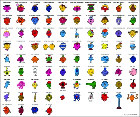
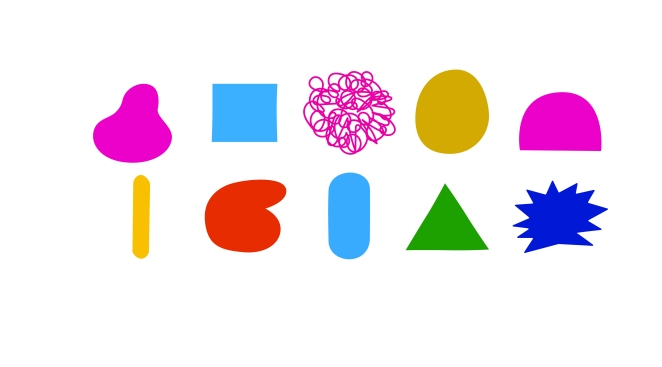
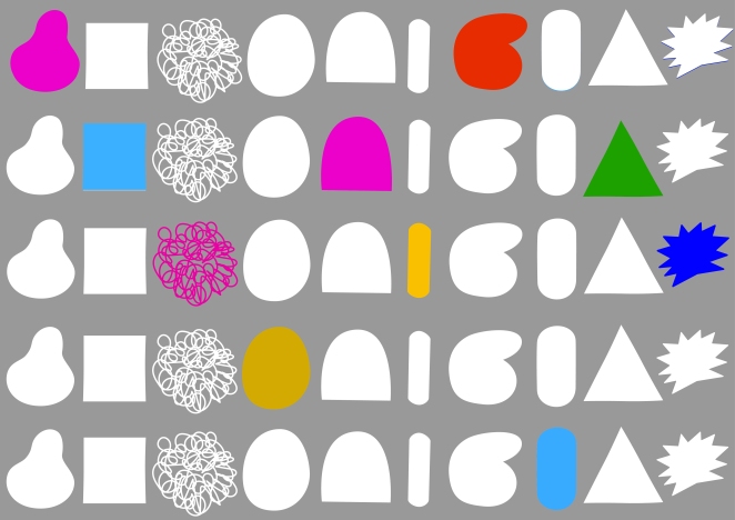
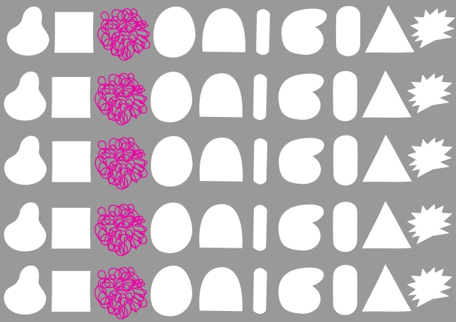
I was introduced to the team and they wasted no time settling me in and getting me started on my project. Coming up is the Mr Men 45th anniversary and Kate the graphic designer wanted me to begin by going onto the illustrator application and have a play around making some of the shapes of the Mr Men and Little Misses. The brief was to make them quite minimal and semi-abstract looking yet keeping a resemblance and maybe including some of the accessories they have. I didn’t feel too confident on illustrator and I was really nervous about making a good first impression. As I began, I looked at inspirations from designs such as ‘Nekkeidia’ and ‘memphis’ on pinterest. This gave me the idea of shape and block colour I should use.


Below are the first Illustrations that I did. It took me over 2 days to complete them and I wasn’t happy with the finished results. I blamed the fact I wasn’t as clued up as I had wished on illustrator and also my roots are within textile design rather than graphic/illustration. It was a steep learning curve and over the days I have been working on the programme I now feel much more confident and aware of how to use it.
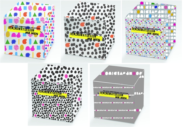
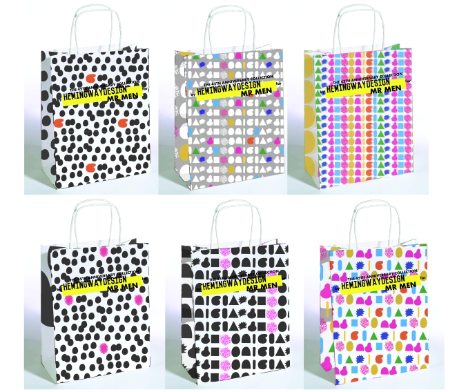
Thursday 7th January: Pattern design/Product design
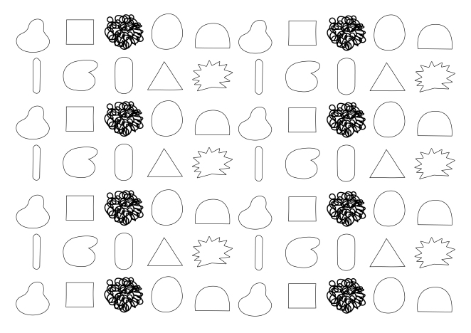
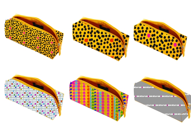
By using the colors and shapes only of the Mr Men and Little Misses, my next task was too create pattern designs using the Illustrator application, again so they resemble Mr Men and have a likeness.
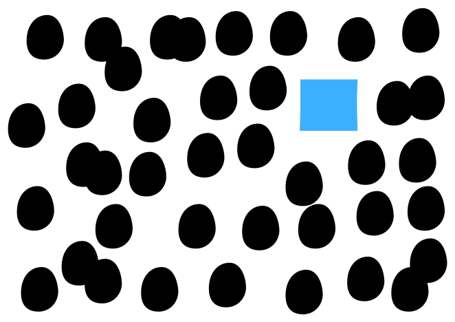
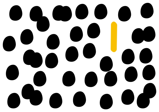
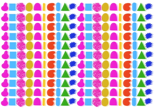
Below are some patterns I produced being inspired by the shapes and colours of Mr Grumpy and Mr Skinny. The black dotted shape is that of Little Miss Magic and I repeated to create more focus on the coloured shape.
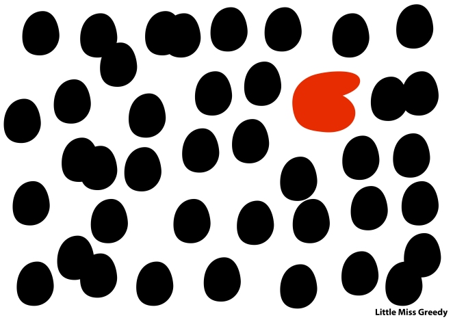
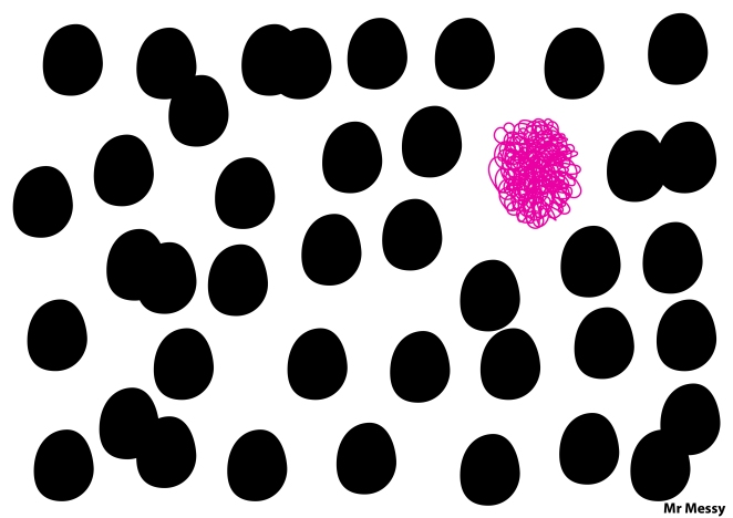
I thought that as an Individual piece it was a good idea to put the title of the Mr who inspired the pattern, this makes it more obvious if it already wasn’t that the shapes are Mr Men. I removed the names when making them into patterns.
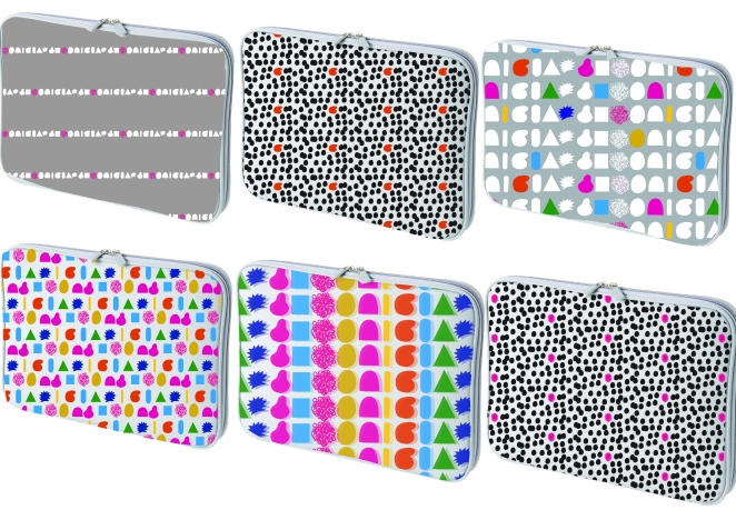
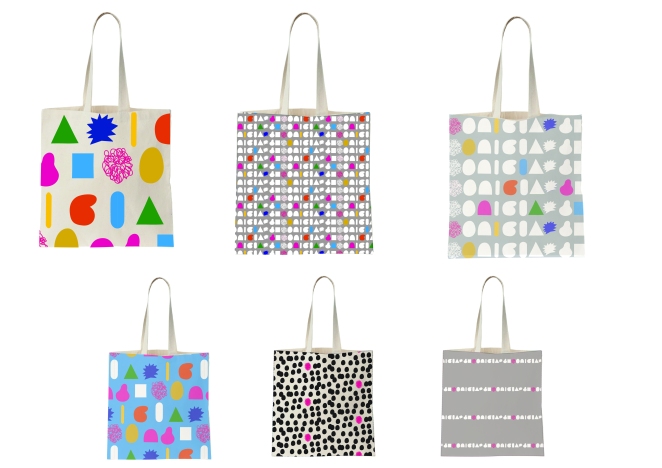
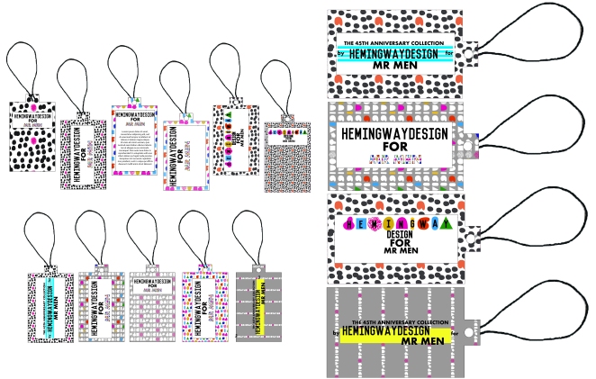
From the patterns I began to apply the designs into product templates. A lot of the work I have been doing on illustrator has been self taught as the team at Hemingway design are very busy getting on with their own work and cant afford to waste time by going through each and every tool/process with me. They are very helpful if I have any quires and help me as I need.
Friday 8th January: Product branding
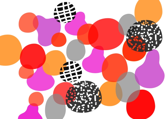
I was asked to come up with the branding f0r the Mr Men range. Kate sent me some examples of the branding Hemingway Design had come up with and she wanted me to work within the same style. I churned out quite a few examples as I wanted to keep the fun of the Mr Men apparent yet the modern style the Hemingway Design.
![]()
Some patterns work better than others. A few work quite well for a older age group that possibly grew up with the Mr Men books from the get go. Yet some are still quite fun and colourful for the younger ages.