Dada, surrealist movement, photographer, painter, variety of media, distorted, division of space, geometric

Divisions of space, mirro/smashed effect, reflection, distortion, movement
 Mathematical object


Dada, surrealist movement, photographer, painter, variety of media, distorted, division of space, geometric
Divisions of space, mirro/smashed effect, reflection, distortion, movement
Mathematical object

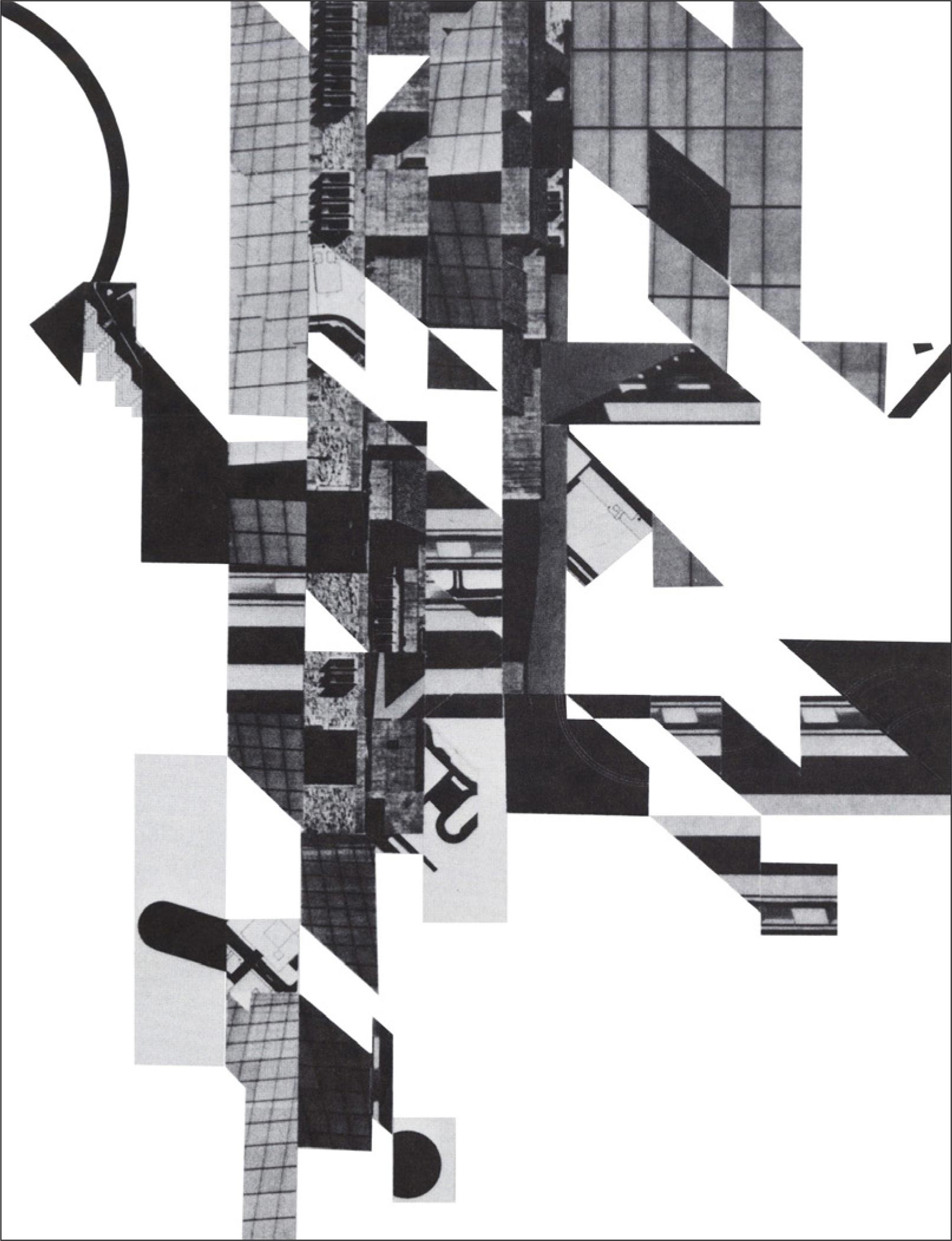
Daniel Libeskind is a polish born architect who has graced his talents all over the world, in countries such as Canada, America, Germany and England. I think that his work might just be the key to linking all my work together. His style is very edgy, urban and his buildings are renowned for being very angular. He illustrates his plans by doing sketches and models. I was drawn to his collaged models covered in maps and fractured/displaced collaged drawings as I can relate them to my work.
Here are examples of Libeskin’s work:


Dystopian- It describes an imaginary society that is as dehumanizing and as unpleasant as possible.
Alumni- A graduate or former student of a specific school, college, or university.
Avant Garde- New and experimental ideas and methods in art, music, or literature.
Utopia –an imagined place or state of things in which everything is perfect.
Expressionism- a style of painting, music, or drama in which the artist or writer seeks to express the inner world of emotion rather than external reality.
Altruism- disinterested and selfless concern for the well-being of others.
Surveillance- close observation, especially of a suspected spy or criminal.
Tyranny- cruel and oppressive government or rule.
Epitomised- be a perfect example of.
Juxtaposition- the fact of two things being seen or placed close together with contrasting effect.
Participation- the action of taking part in something.
Potential Of the Medium- having or showing the capacity to develop into something in the future.
Appropriated- take (something) for one’s own use, typically without the owner’s permission.
Discord- disagreement between people.
Tension- the state of being stretched tight.
Context- the circumstances that form the setting for an event, statement, or idea, and in terms of which it can be fully understood.
Correlate- have a mutual relationship or connection, in which one thing affects or depends on another.
Hyperbole- exaggerated statements or claims not meant to be taken literally.
18th November 2015

Director Michael Radford’s adaptation of the original 1984 Novel by George Orwell’s. This film was highly influential in the 20th century and saw the making of TV programmes such as Big Brother and Room 101. It is Orwell’s prediction for the future – 24 hours surveillance daily, desensitisation and a world that is constantly at war for reasons forgotten.
Who controls the past, Controls the future. Who controls the Present, Controls the past.
My thoughts: The film feels and is very relevant to the now. With everything that is going on in our world, we are almost put in a situation where we have to choose what we too believe. Do we believe the media, the ones feeding us the information on wars and politics, are they distracting us from the bigger picture? Or do we awaken our inner consciousness to have a real understanding of the goings on, but then have to ask ourselves if we are looking into it too much, thinking about it too much and making something of nothing. In the film, the characters have little or no choice, if they disagree with the ways of the party leader it is an offence put under the term ‘thought crime‘.
17th November 2015

Blackburn born Wayne Hemingway, founder of the famous label ‘Red Or Dead’ was a visiting lecturer. He gave us a insight on how he has become so successful, along with his business partner and wife Geraldine. His success has come down to him taking risks, chances and being brave with his decisions. At the age of 18, Hemingway and his partner moved to London with £50 each – basically to live their lives and party. They had no plan of action and soon found them selves running out of money. As their rent was due, they had no other options but to literally sell the clothes of their back. They tried their luck on a stall at the Camden Markets, raking in £200… their rent was £6 for the week and with the rest they celebrated and thought up of a way to make even more. Geraldine was a skilful sewer, and made a few garments to sell on their stall… they began to make more and more profit and shopped in second hand shops, ‘shoddy’ clothe warehouses and bought worn/broken Dr. Marten boots to repair and sell on. At the age of 20 Geraldine found her self opening her own clothes shop at the Kensington Markets… not long after opening she received a HUGE order for her 8 styles of clothing to be made 300 times each from LFW contributors ‘Macey Newyork’. From this they came up with the label Red or Dead.
He sold the Red or Dead label and is now the owner of the multi-disaplinory business ‘Hemingway Designs‘. They design anything from furniture, sustainable housing, paint (crown), wallpaper (Graham and Brown) and work uniforms for the likes of McDonalds and Virgin trains. He is also apart of the new scheme Blackburn is Open (click to go to website) this is a project to help rediscover Blackburn for the youth culture.
MOTO: ‘Design is about improving things that matter in life’.
I found his story interesting yet thought he could of gone into more detail, a little vague in areas. I’d love to know more about his apprenticeship schemes and more about what his business does and is about. It definitely made me realise that you can achieve anything if you really try and really want it too happen. It was inspiring and made me feel good, made me feel like I will and can make something of myself, no matter what grades/results I achieve in education. His lecture taught me to be brave, take chances and that you can be self taught, you don’t necessarily need a background of education to go into a specific business/design (unless to be a doctor). Basically life is trial and error, and if you fail pick your self up and try something else.
Pinterest has become my most favourite way of researching! I have found that it is now my port of call if I am need of inspiration or links to my work. Since beginning unit 5 I have accumulated a wide range of images that link within my project and that will help to show the direction of my work. Here is a link to my board which I have named FAD (Foundation Art Diploma)… Pinterest Board
“The ability to think through, think about and think with pictures”
As I have been placed within the visual communication pathway, to gain a greater understanding for the pathway, a selection of students had a session with a lecturer. To begin the lecture, each of us had to rate our knowledge of visual literacy from 1-10, with 10 being we know everything about the subject. I scored my self a 3, as I felt I knew the bare basics. We spoke about how we visually think and where visual thinking comes into play.
Visual Formats
The list could go on.
We use visual literacy for reasons such as:
We all participated in a exercise which asked a few questions of what we saw in images of art work which has made some form of impression on the lecturer.
Questions:
The images included work from Jackson Pollock, Sandro Botticelli and a photograph from Will Counts. In this exercise we used words to describe such as: Hectic, messy, harsh, mark making, unclear thinking, expressive marks, chaotic, distressed, Vunerable, vibrance, idealistic, exposed, dreamlike, figurative.
At the end of the session we rated ourselves again. I gave myself a 7…
t

Richard Diebenkorn, An American abstract expressionist born 1922-1993.
In Diebenkorn’s later career he picked up a distinctive geometric style, he paints using oil colours and his landscapes seem to be inspired by fields.


Discussed in my formal assessment, Jo and I decided I would fit best in the visual communication pathway with textiles. Researching the Victoria and Albert museum I have come across a few pieces that inspire me. I am attracted to surfaces, texture and embroidery and from this I am wanting to study surface print/design at university.
Inspirations from website:
The Asia collection at the VAM
Iconography of the Buddha: http://www.vam.ac.uk/content/articles/i/iconography-of-the-buddha
First of all, I was drawn to the the South Asian pieces due to their decorative style and decaying paint on the surfaces, as I like layering in my work it to me looks interesting. I then looked more into the history, and liked the concept of the Buddhist faith. A lot thought goes into the sculptures so that the Buddha is portrayed in the correct way. In the work that I have produced so far on the FAD course, I have been looking at creating geometric shapes and layering using the mono print method, from this I have had the idea of looking at maps/mapping for inspiration. When looking at maps, I then get the thought about going on a journey, and The Buddhist religion is all about the path to enlightenment, a pilgrimage to find it. From this starting point, I would like to research in more depth the journey of the Buddhism, places that people associate with Buddha. Visually, I would like to look at the surfaces and the line, shape and colour of the sculptures and art along with the symbolism for it such as the lotus flower and the hamsa hand.
The buddha pilgrimage sites: http://www.vam.ac.uk/content/articles/b/buddhist-pilgrimage-sites-india/
Inspirations from my visit:
Linking to my work that I have produced in units 1-4 with the geometric shapes, I liked the ancient architectural drawings and sketches from Iran. I feel that I can get more from this than the Buddha route as I can develop more imagery with the architecture.


The techniques that I would like to carry through with me on this unit are:


